
Designers, here’s how NOT to format a white paper
Nothing undermines a good white paper faster than poor design.
If you’re not sure how to design a white paper, or you’ve never done one before, read on.
A white paper is neither fish nor fowl, if you’ve heard that expression.
A white paper is something between a marketing piece and a scholarly essay.
It’s not a brochure, so it shouldn’t be as slick and colorful as one.
But it’s got to be more visually appealing than a report cranked out of Word.
Think of a page from a magazine like Scientific American or Vanity Fair, or the front part of an annual report, before they get to the numbers.
That kind of crisp, elegant editorial design is what you want to shoot for.
Most of all, here are five things you must NOT do when you format a white paper.
Stumble into these pitfalls and you’ll make it harder for every reader to plow through your document.
And if no one reads it, kiss goodbye to all the hours and all the money that went into that white paper.
Design no-no #1: Lines too long
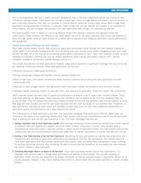
The classic rule of thumb for easy reading is to limit any horizontal line of type to 12 words, or about 60 to 66 characters.
That applies both on-screen and on paper.
Why try to squeeze 100 characters into each line?
Why do some white papers run a horizontal line of type all the way from one side of the page to the other?
How readable do you find the example shown above?
Yes, that’s hard for our eyes to scan… and tough for our brains to process.
Format a white paper like this, and for sure you will lose most of your readers.
Design no-no #2: Awkward page breaks
Why would anyone start a major new section at the very bottom of a page, with only a line or two of text following?
Here’s an example of an awkward page ending…
In this case, the new section is also smack up against a footnote…. which is also crammed up against the footer. Isn’t all that jarring and pointless?
There’s nothing “wrong” with leaving a little white space at the end of a major section. Just start the new section on a new page.
Your readers know how to flip a page, or scroll down the screen. They’ve been doing it since they were two.
See how much better this page looks with some more white space…
That little fix up costs nothing but a few seconds of thought. But it gives readers a momentary break, and helps them see the structure of the paper.
Design no-no #3: Wall of grey
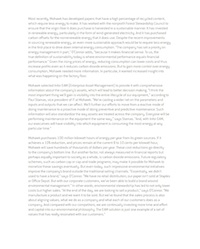 This is the tech manual school of design: Just pour the text into the pages, all 300 of ’em.
But a white paper formatted as a wall of grey text won’t engage anyone.
See for yourself… how do you like this page? How likely are you to read it?
Instead, use “text organizers” to break up the wall.
Text organizers are all those little devices like bullets, boxes, shading, sidebars, callouts. These visual breaks can help highlight the key message of each page and provide some welcome eye relief.
Ideally your white paper writer will provide some of these. If not, see what you can come up with.
Design no-no #4: Pages too busy
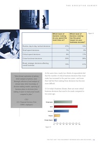
But don’t go to the other extreme, and make your pages like a pizza box.
Too much color, too many graphics, too many things to take in at once will conspire to turn off your audience.
Here’s an example of just too much on one page.
Instead of supporting the white paper’s argument, all these graphics are just competing for attention.
Select the most powerful and appropriate single graphic for any page and use it. Keep the rest for later, or drop them.
Design no-no #5: Useless hyphens
Computer software does a terrible job of hyphenating English. If you let it, it will break words like “sy-stem” and “Or-acle.”
Traditional typographers called for “four-down”; in other words, at least four letters down before any hyphen.
And if you absolutely must even up a paragraph with a hyphen, take a second to do it thoughtfully.
For example, I like to create recognizable root words by inserting optional hyphens manually. It only takes two seconds.
For example, in the word “thankfully” the two obvious places to put a hyphen are “thank-ful” and “thankful-ly.” This simple tactic builds readability, instead of tearing it down with meaningless breaks like “than-kfully.”
And never break your own company or product names with a hyphen. That’s just not right.
Design should enhance content, not undermine it
As you know, the texture of your typography, the look and feel of your pages, have a powerful subliminal effect on readers.
Lines too wide, awkward page breaks, a wall of grey, busyness, useless hyphens: Avoid all these when you design a white paper.
Then your pages will have a much better chance of being read and acted on. And you’ll be adding value to that content, instead of undermining it.
Do you have any further design tips or things to avoid that you could tell us about? Please leave your comments below.
Want to hear whenever there’s a fresh article on this site? Subscribe here to stay in the know on long-form content. From time to time, we’ll also send you word about some great new resource or training. And you can unsubscribe any time.
If you liked this post...


Hi Thanks Gordon. Can you help me with, what is the tool used here to design whitepaper.
Well, there are two main software programs used to design white papers.
1. Non-designers like myself work in Microsoft Word. You can achieve a lot with Word if you do careful formatting with styles, graphics, multiple columns, and text boxes. But Word can take a long time to master.
2. Professional designers tend to use Adobe InDesign, which gives even finer control over typography and graphics. The only drawback to using InDesign is that the output is a PDF, so a client can’t just open it in Word to do fixups or updates.
Some clients ask a designer to work in Word, but few of them will. Hope that helps.
[…] Preparing graphics and designing pages […]
[…] in White Paper Design ← Designers, here’s how NOT to format a white paperDon’t give leads to Sales too soon […]
Are White papers typically numbered? I am not sure where the idea of numbering white papers such as issue #1, issue #2, etc. may have started?
Hi Jen:
I took your question to Gordon and here’s what he said:
“Well, I haven’t seen many white paper numbered as issue #1 and so on. Nothing wrong with it by definition, if those white papers are really intended to be read in a certain order.
But I wonder if a vendor wouldn’t paint itself into a corner by doing that? What if later they wanted to split one paper in two, or update one? The numbering system would only get in the way.
So I can’t say I recommend that approach, or that it’s any kind of best practice.”
Hi Gordon, Are you still using Word and what do you think about using pre-prepared templates? Thanks.