Quick tip: Format white papers for the screen, not the page
I’ve seen figures saying 90% of all white papers are viewed on-screen.
Yet too many white papers are still formatted like printed books:
- Long paragraphs of text
- Skimpy white space
- Few visual breaks
- Lots of extra pages at the start
Making a white paper like a mini-book is NOT the way to reach busy prospects.
Here are three tips to make your white paper easier to read on-screen.
Plus one quick bonus tip for your white paper designer.

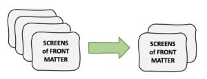
Screen-writing tip 1: Shrink the preliminaries
Busy readers don’t want to scroll through screen after screen of blah-blah.
I’m not saying get rid of all front matter. If you handle your front matter right, it can give a useful overview of your white paper.
Here’s how:
- List the contents with clear section titles
Ideally, viewers can scan down the titles to see your argument in brief. - Push About the Company to the end
Too much promotion too early can turn off viewers. - Include a brief executive summary
Make it a quick overview of the paper in 150 to 200 words.

Screen-writing tip 2: Break up long paragraphs
One student looking through the swipe file of white papers I’d given out came up with an extraordinary discovery.
“Gee!” he exclaimed, “Your average paragraph is only two sentences!”
Yes. Just like in this blog.
That has nothing to do with the flow of the content, and everything to do with how the text shows up on screen.
No business person wants to read run-on paragraphs that would put Marcel Proust to shame. Especially online.
So forget what you learned in school about how any proper paragraph must have a topic sentence, two or three sentences of discussion, and a conclusion.
 Just press Return every couple of sentences.
Break up your text with subheads or bold, as I’ve done in this article. Your readers will skip less and absorb more.
Screen-writing tip 3: Stop using roundabout sentences
Unlike competing designs for server-side communications that copy the last forty-eight rasterized lines to temporary storage, the Acme Scanomatic 3000 provides excess capacitance that covers brownouts as short as 50 milliseconds.
This sentence is wordy and hard to follow. And that’s partly because it features a two-clause construction:
Clause 1: Unlike competing designs … blah blah blah …
Clause 2: the Acme Scanomatic 3000 … blah blah blah
When I write for the screen, I try to break roundabout sentences like this in two. Or three. Here’s how.
Sentence 1: Most competing designs … blah blah blah. (period)
Sentence 2: The Acme Scanomatic 3000 uses a better approach. (period)
Sentence 3: The rest of the blah blah blah. (period)
For extra points, make each sentence a separate paragraph!

Bonus tip: Let the sun shine in!
Books are mainly text, with wide horizontal lines of words and modest margins around a sea of grey text.
How can you make your white paper more visually inviting than a book?
Here’s one simple way: Add more white space around the margins.
That shrinks the width of your text column, which makes it easier to read.
I realize this is the job of the white paper designer. But if you have any say, raise your voice in favor of more white space.
Get your designer to let some sun and air into your white paper.
Remind them people are viewing your document on the screen, not in print.
For more quick tips like this, subscribe to my free newsletter.


