You asked: Why do clients expect writers to design white papers?
The question “who does design?” comes up often from white paper writers.
Even Bob Bly—the copywriter’s copywriter—wonders why clients don’t listen when he says he writes text, but does not provide finished design.
In my experience, most B2B companies already have a designer they work with.
Of the 300+ white papers I worked on, I have done the page design for perhaps 20… about 1 in 15. So it doesn’t happen often.
But when it does, it can be a doozie.
Why do clients want design bundled in?
I believe there are four main reasons why a client may want a writer to do design:
- They want to keep the white paper text in Word
- They don’t know what professional design is
- They know what design is, but they have no budget
- They have a budget, but they don’t know any designers
Let’s look at each case and see what we can make of it.
1. A client wants to keep their white paper in Word
Some clients really want their white papers in Word.
That seems to make them feel more in control of the end result.
Perhaps they imagine they will be able to tweak the text themselves to keep their white papers updated for years to come.
Unfortunately, this approach will limit their options and undermine their results.
For one thing, no designer I’ve ever met wants to work in Word.
 Word is fine for office work. But it doesn’t have the same fine control over spacing, typography, or graphics as software like Adobe InDesign.
In this case, I try to explain the benefits of professional design:
• An inviting cover gets more downloads
• More readable pages that prospects spend more time on
• That likely means more conversions
More downloads, better engagement, and more conversions…
That’s a lot to gain by letting your text go free from Word.
Beyond that, the whole premise is flawed.
Few clients ever touch up their own white papers, so they don’t really need the final document in Word.
I explain to the client how to touch up a PDF without going back to the designer.
They can do that with Adobe Acrobat Pro or many competing products, some of them free.
Or if it’s just a small text change, I can do that for them for no charge.
So this reason for avoiding professional design really doesn’t hold water. Don’t you agree, Mr. Client?

2. A client doesn’t know what graphic design is
This is a sign of inexperience with publishing or content marketing.
I patiently explain the two parts of any publication: content and format.
On a webpage like this, the content includes the words and photos that convey the actual message.
The format includes the typefaces, spacing, columns, and all the other elements of a style sheet that determine the look.
In white papers, the writer provides the text part of the content.
The designer covers the rest of the content by finding and placing graphics.
And then the designer provides the format, by pouring text into pages and tweaking everything to look professional.
Doing effective web design is a skill that takes years to master.
And so is doing effective editorial design.
Not many writers are interested in learning about that. And fewer still have actually mastered it.
So it’s a little silly to expect a writer to do design as well. Don’t you agree, Mr. Client?

3. A client has no budget for design
Scrimping on design for a white paper is penny-wise but pound-foolish.
If a white paper looks too ugly or overwhelming to read, it will fail:
- No one will read it
- No one will gain trust for the company
- No one will take the next step in the customer journey
- No one will buy
- No return will be earned from the sponsor’s budget
I’ve had half a dozen perfectly well-written white papers ruined by poor design.
And in my recent analysis of 300 white papers, I found at least 20 had been hobbled by an insufficient budget.
Trying to do a white paper on a shoestring budget with nothing to spend on design is not a good recipe for success.
A few writers, including myself, can actually do acceptable semi-professional design. But we can’t do it for free. And we can’t do it instantly.
No white paper formats itself.
If a writer has to struggle with Word for a day or two to come up with a good look for a white paper, they should be paid for that effort.
Don’t you think so? Don’t you agree, Mr. Client?

4. A client needs help finding a designer
This is one case where a writer can really help.
Why not make an alliance with a good designer or two?
So when a client needs design, you have options.
— You can subcontract the design work to your chosen designer.
And you can mark up whatever the designer charges. If they ask for $800, mark that up to $1,000. If they want $1,000 mark that up to $1,250.
That’s a standard operating procedure for any agency.
— Or, you can simply pass them the work.
You can do that either as a favor or for a small finder’s fee like 10%.
Most freelancers are happy to pay a finder’s fee for work that pops up in their Inbox.
Either way, you’re likely going to want to proofread the PDFs and send fixups back to the designer. That takes an hour or two per project.
So all writers should include some time to cover that in our white paper pricing… even when we do the client a favor by finding them a good designer.
But speaking of good design, what is it exactly?
The goals of good editorial design
In my book, the goals of good design are to make a white paper:
- Readable so that readers are motivated to finish it
- Scannable so that busy executives can size it up quickly
- Professional so that it reflects well on the client
If a white paper designer achieves all three goals for the intended readers, they succeed. If not, they fail.
Readable pages have large enough letters (11 or 12 points) with strong contrast (100% black text on white) with a short line measure (90 characters or less).
A readable page has lots of white space at the margins and some white space between paragraphs. The text isn’t crammed in with a shoehorn.
Scannable pages have text broken up into short chunks, with many elements that make for quick scanning: headings, bullets, tables, and graphics.
By skipping through the headings, a reader gets a good overview of the content.
Any tables and graphics communicate at a glance, with no need to stop and scratch your head to decipher them.
Professional pages use the sponsor’s logo and color palette in a tasteful way. They add branding without going overboard with distracting elements.
Some white papers I designed myself
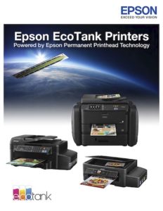
Here are three sample white papers I designed myself.
I’m not saying these are the most gorgeous things the world has ever seen.
I’m presenting these to show you what’s possible with Word. I made these in Word, saved a PDF from Word, and then sent both the Word source file and the PDF to my client.
I hope you agree that these are successful by the standards explained above: readable, scannable, and professional.
This 2-column format keeps the text line narrow and readable. But I seldom use two columns today.
Research shows that nearly all white papers are viewed on-screen. A two-column format forces readers to scroll up and down their screens. That can be annoying.
You can insert graphics and stock photos with two columns in Word, but it’s tricky. Be patient.
This is probably the most elaborate design I ever did for a white paper in Word.
This includes headings, tables, yellow highlights, and graphics. The blue matches the client’s logo. Notice the mini-case studies in circular text boxes with text running around them. Those took some fiddling!
The cover photo is one of my favorites, showing a typical finance executive at work.
This paper features amazing graphics…. so amazing they were still being tweaked right up to deadline.
With no time for professional design, we just released the draft I’d been doing in Word.
That was good enough for a huge product launch.
What do you think: Would professional design have improved this paper very much?
One white paper, two ways
I consider myself a power user of Word: I’ve been using it for 35+ years.
The following samples show two different approaches to the same text, both done with Word. Again, you can click the thumbnails to see the full PDFs.
There were several different audiences for this paper:
- Chief operating room nurses
- Heads of surgery and surgeons
- Other administrators and managers
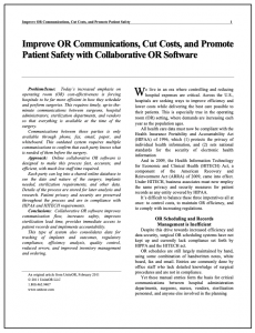
Since doctors are used to reading medical journals, I created a typical 2-column journal format for the surgeons. It’s bland, but it’s what they’re used to seeing.
Then I took the same text, added a stock photo for the cover, and created a more visual format for the management audience.
It’s 98% the same text with a 100% different look.
What do you think? Can you believe I used Word to create both versions?
So how about you. Do you enjoy putting Word through its paces?
If so, don’t shy away from doing design in Word when the opportunity comes along.
But if not, tell your client that you’re a writer and they’ll need a designer too.
Are you a writer who gets asked to design white papers? How do you handle that? Please leave us your comments below.
Want to hear whenever there’s a fresh article on this site? Subscribe here to stay in the know on long-form content. From time to time, we’ll also send you news about some great new resource or training. And you can unsubscribe anytime.


I think your EcoTank white paper for Epson works great as is. Nice work.
I’ve been a professional writer and graphic designer for decades.
With the Adobe Creative Cloud applications at my disposal, I wouldn’t dream of designing anything in Word. Any time I’ve tried, I’ve found it extremely frustrating. I don’t even like to write using Word. I use Scrivener for most of my writing and, if necessary, copy and paste the draft into Word to send to the client.
Your design samples are great, regardless of the software you used! Thanks for sharing them.
Same, Kerry. Scrivener for copy, Adobe for design. Corel is a reasonable alternative. I’m enjoying Gordon’s samples here though because they should what I can get away with as someone who has designed for a few college courses and a few personal projects. I want to complement my writing with design, it’s just a less developed skill right now.
I’m impressed that I’m starting to see more copywriters acknowledge Scrivener. It’s hard to find resources for unconventional uses for it, but it really does have so much potential for audiences outside of fiction and academics.
That’s totally amazing. I had no idea that level of design was even possible in Word. Eye-opening!