

How to do a white paper makeover and make every page count
I just downloaded a white paper that’s almost two-thirds overhead?!
Can you believe it: 7 out of 11 pages are the “wrapper” around the content.
Every white paper needs some overhead, just like a sandwich needs two pieces of bread to hold it together.

But when this counts for nearly two-thirds of a white paper, something is terribly wrong.
That’s like a sandwich with several pieces of bread on both top and bottom.
That makes it hard to find the “meat,” hard to chew and hard to digest.
Below is an overview of this actual white paper, with a thumbnail for every page. In case you’re wondering, this was produced by software firm Symantec.
Download it to see for yourself.
See what I mean about overhead? Now let’s look a little closer at this white paper to see what’s what.
Let’s consider each main part of this paper:
- Front matter that gets us started
- Main body that presents the real content
- Back matter that wraps everything up
Front matter: 3 pages (2 could be cut)
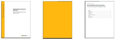
Page 1 = cover page: acceptable, although this one is boring with text but no graphic.
Page 2 = blank color page: a complete waste of paper, toner, time, energy, atoms and bits?!
Page 3 = table of contents: questionable in such a short document.
Some or all of these elements are likely dictated by a corporate-standard design for the company’s white papers.
But standards can be changed. It would be far more effective to dress up the cover with a graphic, drop page 2 like a hot potato, and question the need for page 3.
Actual content: 4 pages (would be more readable at 5 or 6)
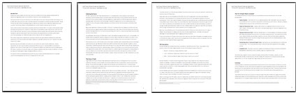
Page 4 = introduction is quite acceptable.
Pages 5 through 7 = not quite 3 pages of real content, unacceptably short for any white paper.
Page 7 includes a brief summary, which is fine.
About that text formatting…
Sadly, the small amount of actual content in this white paper is hard to read.
The horizontal line is ~120 characters wide—at least 50% wider than it should be.
(On a desktop or laptop, the column you’re reading here displays atabout 55 characters wide: Isn’t this easy to read?)
And the white paper body type is 9-point sans serif, which is too small.
People’s eyes begin to change about age 40, and they start to need larger type to read comfortably.
So the basic formatting of this white paper is not well-suited to the presumed target audience: business decision-makers, most of whom are 40 and up.
The simple, no-cost solution is to bump up the body size to 10 or 11 point and enlarge the margins to make the column narrower.
Yes, the text would expand to fill another page or two. But that’s not a bad thing, especially when we’re going to eliminate so many empty, useless pages.
Back matter: 4 pages (2 could be cut)
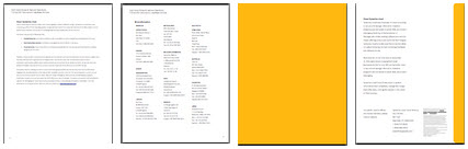
Page 8 = about the company’s cloud offering, an acceptable bit of branding.
Page 9 = company phone numbers, which is useless and can be found on the web in seconds.
Page 10 = ANOTHER BLANKETY-BLANK-BLANK FULL-COLOR PAGE?!
Page 11 = about the company, which is acceptable.
About those phone numbers
The page of company phone numbers shows a serious lack of understanding of how to create a call-to-action.
A white paper, especially one this short, will not likely spark any prospect to pick up the phone and call the order desk.
After all, one of the main reasons prospects read white papers is to avoid talking to a sales person!
A truly effective call-to-action is a quick and easy followup that keeps the prospect engaged and delivers additional value to them.
All this to say, I would drop the phone book page, since it does not contribute any real value to this document.
A new, improved version of this white paper
Here’s an overview of how this white paper would look after being reformatted with all these suggestions.
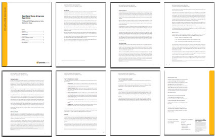
8 pages total, 2.5 pages overhead
In this version, the front matter is reduced to one page, a text-only cover with table of contents.
The actual content is stretched to six pages with a larger font size and wider margins for easier reading.
The summary is bumped to a new page, combined with the content about the company’s cloud offering.
The back matter is cut down to a final page of boilerplate and corporate contact information.
Of course, this document would be more effective if it had at least one infographic to communicate more visually… but the original didn’t have one either.
This cuts 4 pages of flab, powers up the actual content by 2 pages, and still comes in at a slim, trim 8 pages… much better than the original.
What do you think? Would all this make for a slimmer, more effective document? Do empty, time-and-ink-wasting pages of overhead bother you too? Or am I just nitpicking?
Want to hear whenever there’s a fresh article on this site? Subscribe here to stay in the know on long-form content. From time to time, we’ll also send you word about some great new resource or training. And you can unsubscribe any time.

If you liked this post...